 |
The horrible, sad trauma |
|
The horrible, sad trauma |
| Now, you do know I meant it was traumatic for the innocent bystanders who have to look at these shirts, right? Okay, good, just checking. |
|
|
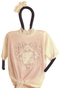
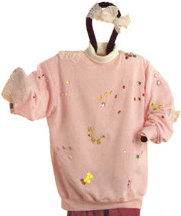
Wow, that's really ugly. It's not completely
without potential, but honestly, it looks like an old, stained tablecloth
that got shrunk and tangled in the wash, so someone sewed it into T-shirt form. That same person then horked up
some phlegm and pretended it was a lacy hair bow that completes the outfit. The belt buckle thingie at the hem is a masterful touch, though. Without it, this would be a simple case of overkill, but the belt buckle takes it into its very own galaxy of tackiness. |
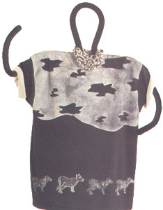
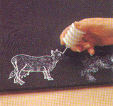
| The line of cows at the hem of the T-shirt is a potentially cute idea, if you're
into that sort of thing, but the crappy fake cowhide pattern at the top has got
to go (I'll bet you thought it was a whole bunch of amoebas, but,
um, no.) Here's a fun experiment. The next time you're driving past some cows who are close to the road, stop your car, get out and go stand by the fence to stare at them. Maybe they're not used to people standing by their fence, or perhaps they get really offended when they're stared at, but usually they'll move away, looking totally disturbed. Try it, it's fun. Really. At least it's more fun than ruining a poor, defenseless T-shirt and then calling it art. |
|
|
|
|
The overkill thing is pretty much a running motif throughout this book. I actually like the sponged-on cows at the hem of the shirt, but those decorating morons just can't leave well enough alone. To add insult to injury, the white paint is iridescent. Ugh. | |
 |
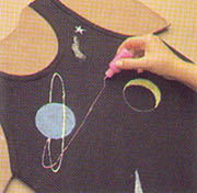
This
one frightens me. Now, I may have disembodied hands issues,
but no matter how you look at it, this shirt is just ugly and dumb. When deciding where to put the hand outlines, the book suggests, "Keep in mind where they'll show up when worn -- don't embarrass the wearer." Um, you know, if someone actually is wearing this shirt, then I think it's a little too late to worry about the embarrassment thing, isn't it? |
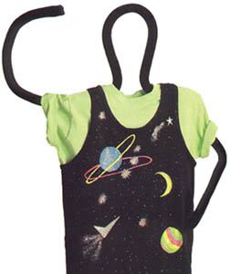
| To be fair, this could be a lot uglier. In fact, in the "Tips and Variations" sidebar they helpfully
tell you how to accomplish that: "You can add more starbursts, if you like, to bring more colour to the design." I'll bet I could also figure out how to blow up someone's garden shed, if I put my mind to it. But just because I can do something doesn't mean that I should. |
|
|
 |
There are very specific instructions that accompany this photo. They tell you
exactly which colours to use, pretty much removing any creativity from the equation. However, they do redeem themselves slightly with the admonishment that "two rings are enough." Amen to that! |
|
© 1999-2010 Cate